|
Edward S. Curtis gained recognition for his Indian portraiture project, what inspired me is the soft focused effect and mostly the sepia tone effect. What I also noticed is that all the old humans have some kind of anger expressions make them not so very happy, and makes you wonder why, also one of the images is of a person working which makes me thinking of the expressions is because they all have a different life. I also noticed an interesting aspect, since Curtis was born in the 1868 photography was still at the very beginning and at that time cameras weren’t fast in the sense that you cannot for example that a picture with a 1/100s pictures were taken at a long exposure, so it might be that to take a photograph is more easy to be taken at a natural look rather than smiling, it is be difficult to smile for such a long time and stay still so pictures could be blurry. I found out that Curtis himself said that he wanted to preserve the identity and culture of the Indian generation because he thought it would be lost forever. BUT – sometimes he didn’t respect the true person. “But the photographs do not always tell the whole story. In order to portray traditional customs and dress, Curtis using techniques accepted by many anthropologists of his day — removed modern clothes and other of contemporary life from his pictures. A portrait of a pigeon lodge, for example, originally showed an alarm clock between two seated men. Curtis cut the clock out of the negative and included the retouched image in the north American Indian” (The Imperfect Eye, 2016) This paragraph shows that somehow people were living a “rich” live but Curtis didn’t respect that and he only showed what he wanted to show that old life. 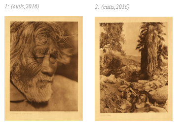 References:
"The Imperfect Eye Of Edward Curtis". National Endowment for the Humanities. N.p., 2016. Web. 29 Oct. 2016. "Edward S. Curtis Gallery » Fine Art » Large Prints". Edwardscurtis.com. N.p., 2016. Web. 29 Oct. 2016.
0 Comments
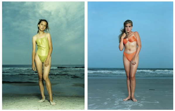 This was a project done by the portraiture photographer Rineke Dijkstra. There are different elements in which to take into consideration, such as, the face expressions, poses, clothing and location. All of these elements clearly show different character and lifestyle.
Starting off with location, at first I thought that is was the same location just taken in a different day with a different weather but when I looked further I realized that the picture on the left was taken in Kolobrzeg Poland on the 26th of July 1992, and the one on the right was taken at the Hilton Head island, S.C, USA on June 24th, 1992 this little detail also that the photographer took this project very serious for the fact that he had to travel a lot for the project. Face expression, straight away you can notice the polish girl is not wearing any make and the other has, so it is like the American girl is more of an upper class person but then if you look at their expressions looks like the polish is happier, but it might not be the case, maybe the American is more into fashion and tried to give such look while the other one is more easy going you can also see this from the posing of the two girls. Mentioning fashion lead us to look at their hair one is setup and the other is normal also the clothing you can see that the American girl has a bikini and has a better fit while the polish has a swimwear but also the fit is not so very good. 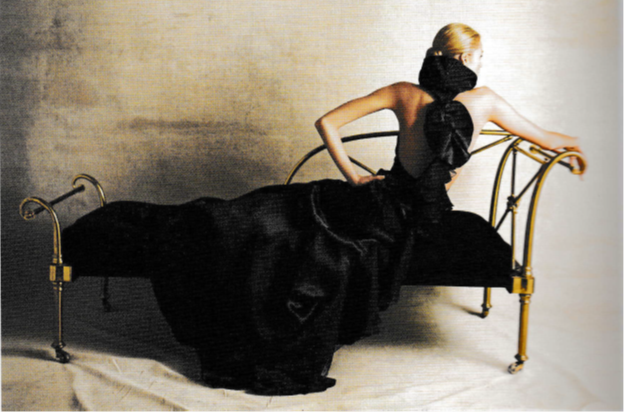 I was looking into a fashion book and came across this image (Photo taken by: Tim Geaney). First off all I liked how the size of the photo is presented on this book on a single page and with a landscape orientation it gave a symmetrical look to the image. Starting off with the colors for the fact that the contrast between the golden wall and the dark blue dress really came out. Everything in the image is in golden color wall, floor and even the bed. I was curious why he opted for those colors (which are two of my favorite colors) so I searched on the web for a color palette and chose that golden color, now with a color palette the matching colors are always the opposite and immediately the opposite color of that golden color was the blue. I also created a simulation of the image just with colors.  Definitely the image taking into consideration the colors, props and everything isn’t a modern style image but more of a classic style which for me the photographer couldn’t find better colors, also the dress is very classic and that is why the position of the model is like that to show the detail of the dress and the he made the dress falling on the floor also to make better contrast, like so everything is combined together and there isn’t any separation. If a had to make something different what I have could done is maybe position the model in a different way to show the front of the dress which I thing it still have some interesting style at the front.
|
AuthorWrite something about yourself. No need to be fancy, just an overview. Archives
May 2017
Categories |
 RSS Feed
